Stephen Lopez is a Product Designer based in Los Angeles.
 

Cracked.com

Growing the Cracked experience

Cracked.com is a forum for discovering new and interesting facts about the world in a fun digestible way. Simply put Cracked is a funny take on intelligence. The Cracked brand was in the midst of a revival and they needed to catch up with the technology around them.

 
Hero-Image.jpg
 

the challenge

A balancing act

The underlying challenge was balancing business goals and solving for user needs while still providing an exceptional experience.

Product Questions

  • How can we make it easier to discover new content?

  • How can we grow Cracked.com?

  • How can we integrate native advertisements seamlessly?

Strategy

Meeting these challenges head-on, my Product Manager and I identified opportunities and brainstormed rough solutions. Each piece had varying amounts of effort but all necessary to accomplish what we set out to do.

Top Priorities

  • Serve up more content

  • Make Cracked.com accessible to everyone

  • Create new native ad placements


More content


More Content

Declutter navigation

The massive amounts of content, coupled with dozens of types of content made it difficult for users to navigate the Cracked.com website. With clear navigation, users were able to find what they needed quickly.


Benefits

  • Decluttered navigation helped information overload

  • Provided new content placement opportunity

  • Highlight important or relevant categories

  • Created stronger hierarchy


newnav.png


More Content

Infinity scroll

The Cracked.com website had years of content under it’s belt. In order to serve users more of that content and help them discover new content, we introduced infinity scrolling throughout the website.

Benefits

  • Fast and easy browsing experience

  • Users were no longer met with a dead-end on the homepage

  • Visitors could discover more content with 0 clicks

 
infinityscroll.png


Accessible content


Accessible Content

Responsive web design

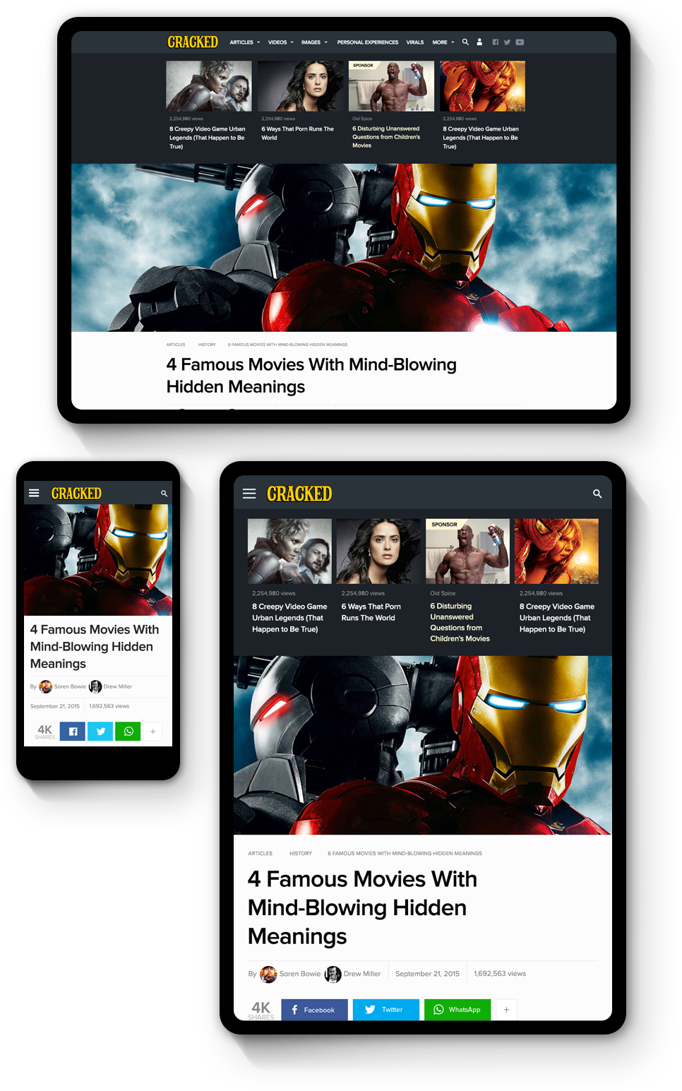
In order to scale Cracked.com, a modernization effort needed to be tackled. To ensure any user was able to view Cracked, at a bare minimum we needed a responsive website.

Benefits

  • Future proof layouts

  • Content is accessible regardless of device

  • Interim mobile solution

responsive.png


Accessible Content

Cracked Reader app

In an effort to expand the Cracked brand beyond a website, we looked to a native mobile experience to engage loyal readers and create a focused Cracked experience.


Benefits

  • Focused user experience

  • Expand the Cracked brand and reach

  • Easier way to engage with the Cracked community


finalcrackedapp.png
 

Native ads


Native Ads

Native ad placements

Core to the Cracked business model was native ad placements. It was my job to integrate these placements while still giving users a seamless experience.

My approach

  • Complimentary visual designs fit into the Cracked brand

  • Design and placements didn’t distract from the user experience

nativeads.jpg


Native Ads

Branded modules

Building off the native ad placements business model, I looked at creating smaller branded experiences that would compliment the content around it.

Benefits

  • A module, sponsors can use as their own

  • Designs would be engaging and complimentary to Cracked

  • Internal team could leverage modules for self-promotion

brandedmodule.jpg


final.png
 

Conclusion


Results

Through a refreshed website and new avenues to discover Cracked content I was able to serve our user’s needs while solving core business goals. By capitalizing on latest trends in web and mobile design the average user session increased from 8 to 9 minutes and monthly page views climbed from 175MM to 200MM within a year.